Here's a thread of all of @LLinWood's recent 🔥 tweets for your safe keeping.
Mike Pence @vp @mike_pence is disloyal to @realDonaldTrump. Mike is also a traitor to We The People.
— Lin Wood (@LLinWood) January 4, 2021
Mike is a good friend to CCP. Too good.
I don\u2019t trust Mike Pence at all. Do you?https://t.co/6NTUl3PDeq
More from Government


Labour Grandees are listed in Sir Keir Starmer's colleague Jeffrey Epstein's ''Little Black Book''; Blair, Mandelson and Alastair Campbell. COINCIDENTLY, Keir Starmer and some of the same people have connections to ANOTHER of the worlds most prolific peadophiles. #StarmerOut

Starmer failed to bring charges against Jimmy Savile for paedophilia. The decision was made despite the Crown Prosecution Service receiving substantial evidence of his crimes from witnesses and victims several years before Savile died in 2011. #StarmerOut https://t.co/PNyX5uSAkw

With a past like hers, Margaret Hodge might show a bit more humility.
In the Eighties Hodge was aware of previous child sex abuse in the care homes for which she was responsible, and did nothing about it. #LabourLeaks #StarmerOut
As leader of Islington Council, a post she held from 1982-92, Margaret Hodge was aware of previous, horrendous child sex abuse in the care homes for which she was responsible, and did nothing about it. #LabourLeaks #StarmerOut #CSA
She was guilty of rather more than a casual failure of oversight. In an open letter to the BBC after it investigated a range of monstrous abuse (child prostitution, torture, alleged murders), Hodge libelled one of its victims as “seriously disturbed”. #LabourLeaks #StarmerOut
Starmer failed to bring charges against Jimmy Savile for paedophilia. The decision was made despite the Crown Prosecution Service receiving substantial evidence of his crimes from witnesses and victims several years before Savile died in 2011. #StarmerOut https://t.co/PNyX5uSAkw
With a past like hers, Margaret Hodge might show a bit more humility.
In the Eighties Hodge was aware of previous child sex abuse in the care homes for which she was responsible, and did nothing about it. #LabourLeaks #StarmerOut
As leader of Islington Council, a post she held from 1982-92, Margaret Hodge was aware of previous, horrendous child sex abuse in the care homes for which she was responsible, and did nothing about it. #LabourLeaks #StarmerOut #CSA
She was guilty of rather more than a casual failure of oversight. In an open letter to the BBC after it investigated a range of monstrous abuse (child prostitution, torture, alleged murders), Hodge libelled one of its victims as “seriously disturbed”. #LabourLeaks #StarmerOut
You May Also Like

Speech Delay is most common in children nowadays
In ancient times, our grandparents used to follow typical natural way of caring the needs of a child. All they used were more of natural products than chemical based for the growth of child.

One of major step followed was to feed Gurbach Jadd/ Vasa Kommu/ Acorus Calamus for initiating good speech ability in a child. This stem was needed to babies on Tuesdays and Sundays in mother's milk.
Vasa is feed to baby after the 1st bath on 12th day in week. Weekly only thrice it is fed and named as :
Budhwar - Budhi Vasa
Mangalwar - Vaak Vasa
Ravi Vaar - Aayush Vasa
This stem is burnt and rubbed against the grinding stone in mother's milk or warm water to get a paste
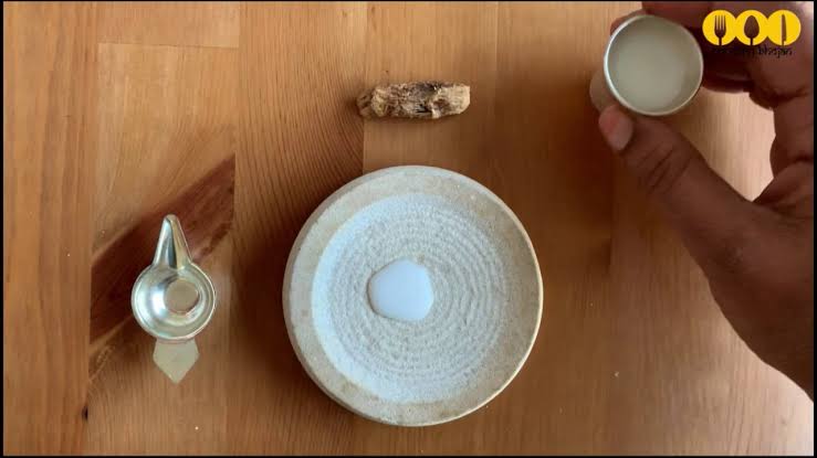
The procedure to make it is in the link
https://t.co/uo4sGp7mUm
It should not be given daily to the child. Other main benefits are
1. It clears the phlegm in child's throat caused due to continuous milk intake. It clears the tracts and breathing is effortless.
2. Digestion
For children who haven't got their speech and is delayed than usual should feed this vasa on these days in week atleast for 6months. Don't get carried away with this dialogue
"Some gain speech little late"
In ancient times, our grandparents used to follow typical natural way of caring the needs of a child. All they used were more of natural products than chemical based for the growth of child.
One of major step followed was to feed Gurbach Jadd/ Vasa Kommu/ Acorus Calamus for initiating good speech ability in a child. This stem was needed to babies on Tuesdays and Sundays in mother's milk.
Vasa is feed to baby after the 1st bath on 12th day in week. Weekly only thrice it is fed and named as :
Budhwar - Budhi Vasa
Mangalwar - Vaak Vasa
Ravi Vaar - Aayush Vasa
This stem is burnt and rubbed against the grinding stone in mother's milk or warm water to get a paste
The procedure to make it is in the link
https://t.co/uo4sGp7mUm
It should not be given daily to the child. Other main benefits are
1. It clears the phlegm in child's throat caused due to continuous milk intake. It clears the tracts and breathing is effortless.
2. Digestion
For children who haven't got their speech and is delayed than usual should feed this vasa on these days in week atleast for 6months. Don't get carried away with this dialogue
"Some gain speech little late"

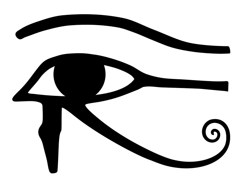
The Eye of Horus. 1/*
I believe that @ripple_crippler and @looP_rM311_7211 are the same person. I know, nobody believes that. 2/*
Today I want to prove that Mr Pool smile faces mean XRP and price increase. In Ripple_Crippler, previous to Mr Pool existence, smile faces were frequent. They were very similar to the ones Mr Pool posts. The eyes also were usually a couple of "x", in fact, XRP logo. 3/*

The smile XRP-eyed face also appears related to the Moon. XRP going to the Moon. 4/*

And smile XRP-eyed faces also appear related to Egypt. In particular, to the Eye of Horus. https://t.co/i4rRzuQ0gZ 5/*

I believe that @ripple_crippler and @looP_rM311_7211 are the same person. I know, nobody believes that. 2/*
Today I want to prove that Mr Pool smile faces mean XRP and price increase. In Ripple_Crippler, previous to Mr Pool existence, smile faces were frequent. They were very similar to the ones Mr Pool posts. The eyes also were usually a couple of "x", in fact, XRP logo. 3/*
The smile XRP-eyed face also appears related to the Moon. XRP going to the Moon. 4/*
And smile XRP-eyed faces also appear related to Egypt. In particular, to the Eye of Horus. https://t.co/i4rRzuQ0gZ 5/*