Krugman is, of course, right about this. BUT, note that universities can do a lot to revitalize declining and rural regions.
One thing I've been noticing about responses to today's column is that many people still don't get how strong the forces behind regional divergence are, and how hard to reverse 1/ https://t.co/Ft2aH1NcQt
— Paul Krugman (@paulkrugman) November 20, 2018
More from Noah Smith
1/OK, data mystery time.
This New York Times feature shows China with a Gini Index of less than 30, which would make it more equal than Canada, France, or the Netherlands. https://t.co/g3Sv6DZTDE
That's weird. Income inequality in China is legendary.
Let's check this number.
2/The New York Times cites the World Bank's recent report, "Fair Progress? Economic Mobility across Generations Around the World".
The report is available here:
3/The World Bank report has a graph in which it appears to show the same value for China's Gini - under 0.3.
The graph cites the World Development Indicators as its source for the income inequality data.
4/The World Development Indicators are available at the World Bank's website.
Here's the Gini index: https://t.co/MvylQzpX6A
It looks as if the latest estimate for China's Gini is 42.2.
That estimate is from 2012.
5/A Gini of 42.2 would put China in the same neighborhood as the U.S., whose Gini was estimated at 41 in 2013.
I can't find the <30 number anywhere. The only other estimate in the tables for China is from 2008, when it was estimated at 42.8.
Today's @bopinion post is about how poor countries started catching up to rich ones.
It looks like decolonization just took a few decades to start
Basic econ theory says poor countries should grow faster than rich ones.
But for much of the Industrial Revolution, the opposite happened.
https://t.co/JjjVtWzz5c
Why? Probably because the first countries to discover industrial technologies used them to conquer the others!
But then colonial empires went away. And yet still, for the next 30 years or so, poor countries fell further behind rich ones.
https://t.co/hilDvv0IQV
Why??
Possible reasons:
1. Bad institutions (dictators, communism, autarkic trade regimes)
2. Civil wars
3. Lack of education
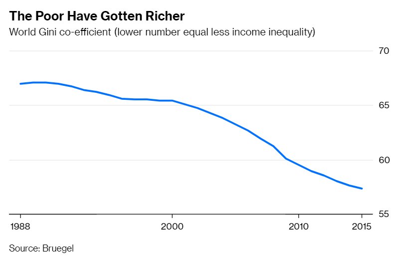
But then, starting in the 80s (for China) and the 90s (for India and Indonesia), some of the biggest poor countries got their acts together and started to catch up!
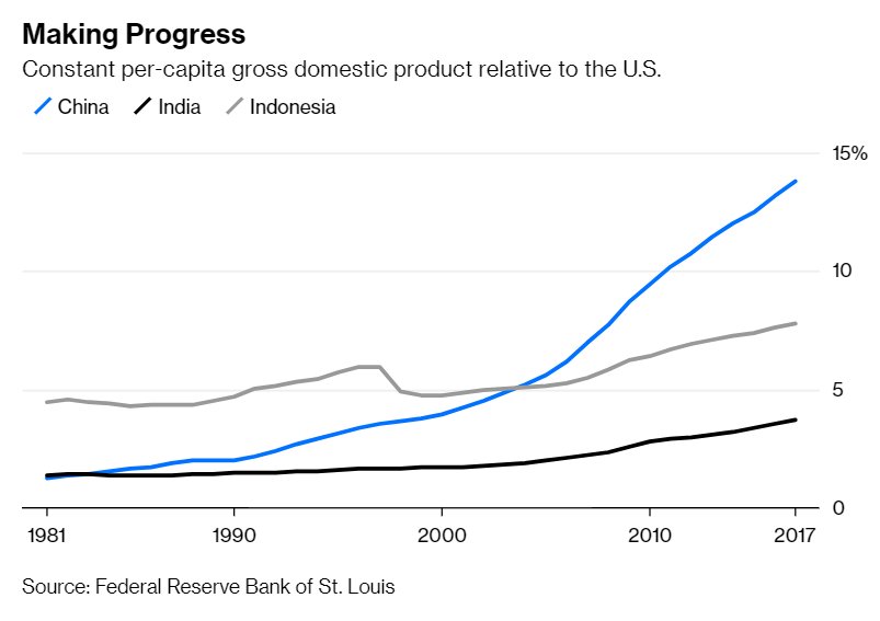
Global inequality began to fall.
It looks like decolonization just took a few decades to start
Basic econ theory says poor countries should grow faster than rich ones.
But for much of the Industrial Revolution, the opposite happened.
https://t.co/JjjVtWzz5c
Why? Probably because the first countries to discover industrial technologies used them to conquer the others!
But then colonial empires went away. And yet still, for the next 30 years or so, poor countries fell further behind rich ones.
https://t.co/hilDvv0IQV
Why??
Possible reasons:
1. Bad institutions (dictators, communism, autarkic trade regimes)
2. Civil wars
3. Lack of education
But then, starting in the 80s (for China) and the 90s (for India and Indonesia), some of the biggest poor countries got their acts together and started to catch up!
Global inequality began to fall.

More from Society


I've seen many news articles cite that "the UK variant could be the dominant strain by March". This is emphasized by @CDCDirector.
While this will likely to be the case, this should not be an automatic cause for concern. Cases could still remain contained.
Here's how: 🧵
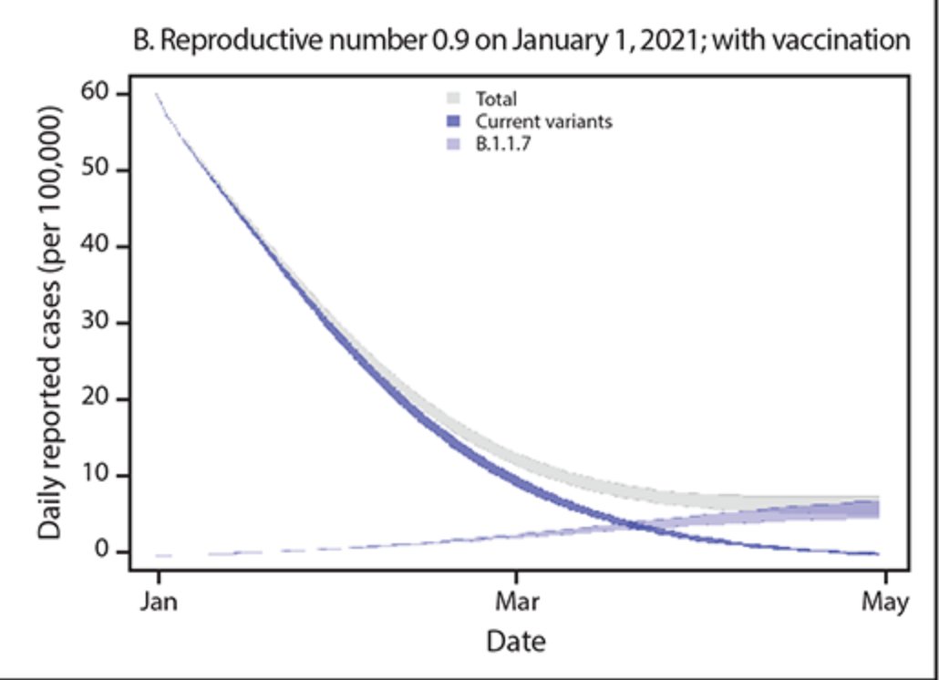
One of @CDCgov's own models has tracked the true decline in cases quite accurately thus far.
Their projection shows that the B.1.1.7 variant will become the dominant variant in March. But interestingly... there's no fourth wave. Cases simply level out:
https://t.co/tDce0MwO61
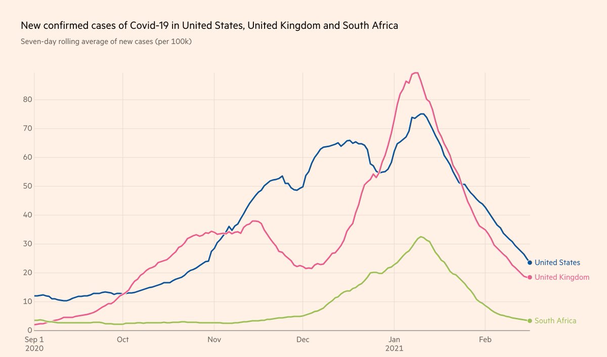
Just because a variant becomes the dominant strain does not automatically mean we will see a repeat of Fall 2020.
Let's look at UK and South Africa, where cases have been falling for the past month, in unison with the US (albeit with tougher restrictions):
Furthermore, the claim that the "variant is doubling every 10 days" is false. It's the *proportion of the variant* that is doubling every 10 days.
If overall prevalence drops during the studied time period, the true doubling time of the variant is actually much longer 10 days.
Simple example:
Day 0: 10 variant / 100 cases -> 10% variant
Day 10: 15 variant / 75 cases -> 20% variant
Day 20: 20 variant / 50 cases -> 40% variant
1) Proportion of variant doubles every 10 days
2) Doubling time of variant is actually 20 days
3) Total cases still drop by 50%
While this will likely to be the case, this should not be an automatic cause for concern. Cases could still remain contained.
Here's how: 🧵
One of @CDCgov's own models has tracked the true decline in cases quite accurately thus far.
Their projection shows that the B.1.1.7 variant will become the dominant variant in March. But interestingly... there's no fourth wave. Cases simply level out:
https://t.co/tDce0MwO61
Just because a variant becomes the dominant strain does not automatically mean we will see a repeat of Fall 2020.
Let's look at UK and South Africa, where cases have been falling for the past month, in unison with the US (albeit with tougher restrictions):
Furthermore, the claim that the "variant is doubling every 10 days" is false. It's the *proportion of the variant* that is doubling every 10 days.
If overall prevalence drops during the studied time period, the true doubling time of the variant is actually much longer 10 days.
Simple example:
Day 0: 10 variant / 100 cases -> 10% variant
Day 10: 15 variant / 75 cases -> 20% variant
Day 20: 20 variant / 50 cases -> 40% variant
1) Proportion of variant doubles every 10 days
2) Doubling time of variant is actually 20 days
3) Total cases still drop by 50%